Product
- Cigarette Display
- Other display
- Counter Cashier Table/Reception Desk
- Jewelry Store Display
- Cosmetic Display Showcase
- Watch Display Showcase
- Phone Display Showcase
- Clothing/Shoes/Handbag Display
- Optical Reveal Ark
- Wine Reveal Ark
- Salon Display Cabinet
- Food and Beverage Kiosk
- Pharmacy Showcase
- Container Villa
Contact Us
Company News
After the jewelry counter is matched, the jewelry is very hot!
Source:凡路珠宝柜台 Author:凡路珠宝柜台 Visit:421 Pubtime:2018-08-27 17:05:25
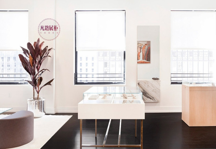
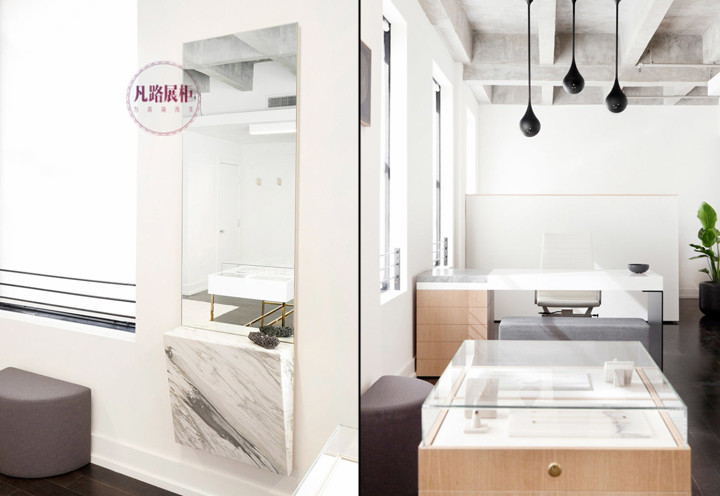
Color is one of the important features of jewelry counter display. When placing, pay attention to the color matching of jewelry, jewelry counter and decoration style. How to match the best jewelry counter?
The color of the jewelry counter should be in harmony with the overall decoration color of the jewelry store. For example, the overall color of the store is pink. The selected items such as the tray for inserting the ring can be white lining and pink border, which is consistent with the overall color of the counter. Does not hinder the placement of jewellery.
The color of the jewelry counter should be able to highlight the color of the jewelry, and the jewelry can be highlighted by contrast or harmonious colors. At present, there are several common matching methods in the domestic market: black velvet trays contain diamond inlaid jewellery, black and white contrasts highlight the bright light of diamonds; white lining red border trays, emerald ornaments, red and green contrasts to highlight the emerald green; Use a white silk tray to put a variety of pearls to highlight the softness of the pearls; use a light blue silk tray to hold platinum jewelry, highlighting the silvery white light of platinum.

The accessories should blend with the color of the counter to set off each other.
(1) Counter accessories: In order to make the whole counter more vivid and sporty, flowers, leaves, plants, vases, stones, etc. can be placed in the tray space.
(2) Wall accessories: The wall of the store is a very good propaganda site. Wall decoration should pay attention to the shaping of corporate image, product image, brand image and service image. On the wall, you can post posters of jewellery brands, corporate logos, corporate service announcements, etc. to increase customer awareness and impression of the company and products.
The introduction of the jewelry counters after the jewellery counters are very hot is here. Funroad Jewelry Showcase looks forward to working with you.
The color of the jewelry counter should be in harmony with the overall decoration color of the jewelry store. For example, the overall color of the store is pink. The selected items such as the tray for inserting the ring can be white lining and pink border, which is consistent with the overall color of the counter. Does not hinder the placement of jewellery.
The color of the jewelry counter should be able to highlight the color of the jewelry, and the jewelry can be highlighted by contrast or harmonious colors. At present, there are several common matching methods in the domestic market: black velvet trays contain diamond inlaid jewellery, black and white contrasts highlight the bright light of diamonds; white lining red border trays, emerald ornaments, red and green contrasts to highlight the emerald green; Use a white silk tray to put a variety of pearls to highlight the softness of the pearls; use a light blue silk tray to hold platinum jewelry, highlighting the silvery white light of platinum.

The accessories should blend with the color of the counter to set off each other.
(1) Counter accessories: In order to make the whole counter more vivid and sporty, flowers, leaves, plants, vases, stones, etc. can be placed in the tray space.
(2) Wall accessories: The wall of the store is a very good propaganda site. Wall decoration should pay attention to the shaping of corporate image, product image, brand image and service image. On the wall, you can post posters of jewellery brands, corporate logos, corporate service announcements, etc. to increase customer awareness and impression of the company and products.

The introduction of the jewelry counters after the jewellery counters are very hot is here. Funroad Jewelry Showcase looks forward to working with you.


 Official website